

Renzoe Box
WHERE BEAUTY MEETS BRAINS
UI / UX DESIGN & RESEARCH INTERNSHIP
AT A GLANCE
During my time at RZB as a UI/UX Design Intern, I had the opportunity to work on two projects, both individually and collaboratively—
Website 2.0
RenzoeV(irtual)
Resolving RZB’s website makeup quiz logic and visual inconsistency through design mockups and written documentation of bugs and errors.
Focus on prototyping and user journeys. Built interactions spanning 4 different features and worked with the Creative team to enhance the mobile experience.
ABOUT ℹ️
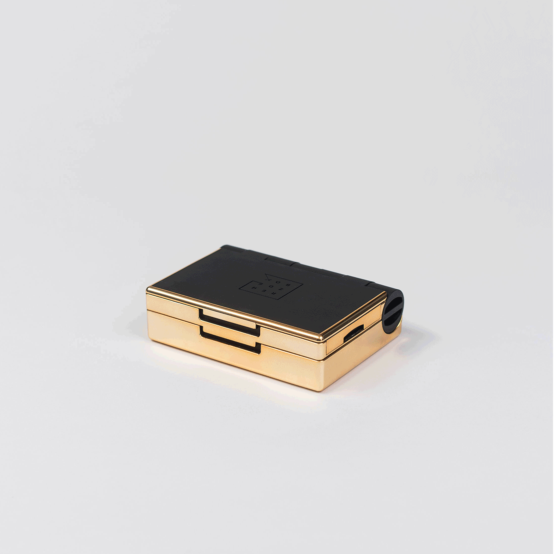
Eliminating the problem of a messy makeup bag, Renzoe Box is a customizable beauty kit combining your favorite brand makeup products into one sustainable compact.
TYPE 💻
Website Development, User Research, UI/UX Design
TIMELINE 🕒
May - August 2021
TOOLS 🛠️
Adobe Illustrator, Adobe XD
Website 2.0
-
User Flow
The makeup quiz, as I found it, was clunky and frustrating to navigate. What was supposed to act as a quick catalyst for personalized recommendations ended up taking more time than necessary, so I restructured the quiz questions, streamlined its language, and prototyped mid-fidelity interactions for the developer to code into Shopify AWS.
-
Conditional Logic
I worked with the front-end developer intern to fix major logic errors and minor bugs affecting the natural flow of the quiz. To bridge gaps in communication and improve the design-to-developer handoff process, I created a Google Doc masterlist that we could reference during each meeting.

-
Layout Redesign
Visual signifiers (i.e. CTA buttons and arrows) were either un-intuitively positioned, or needed to be added. The paper mockup below illustrates one instance of this—the addition of circle icons below each product, indicating multiple makeup shades, removes the assumption that the shade in the product image is the only option available.

RenzoeV
⊹
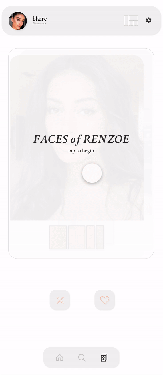
Faces of Renzoe
⊹
RenzoeV ⊹ Faces of Renzoe ⊹
THE PROBLEM
POV…you need to do your makeup for an event 💄 Here are just some of many possible sources you might draw inspiration from:

Choose your makeup adventure. Build your dream palette from scratch, or pick from collections made just for you.
Your newest makeup look is just one tap away.
TYPE

COLOR

WIREFRAMES
FACES OF RENZOE (carousel view) featuring makeup artist profiles and trending tags. Note: this wireframe doesn’t include the “swipe” function
PROFILE PAGE with social info, saved looks, RZB configurations, makeup products, and the user’s current Renzoe Box palette
Color
Black was the most used color, resulting in a rather harsh and out-dated appearance. Suggestions included tapping into Renzoe Box’s brand colors, integrating softer color pairings to reflect makeup hues, and thinning out the bolder outlines that draw attention away from the main visual components.
Iconography
The icons in the navigation bar, namely the Faces of Renzoe and Profile icons (2nd and 4th), were too ambiguous. They were rather unintuitive and confusing to identity, and new users to the app would have difficulty figuring out what graphics lead to where.
Labeling & Identification
The titles I’d given for different categories (i.e. “Recently Saved Faces” and “Shop New”) on the homepage were less personalized and more generic. After consulting my supervisors, we landed on using labels that are tailored to the user, hopefully creating a more intimate, personal experience.
One of the bigger changes I made from V1 was with the Faces of Renzoe interface. I replaced the Preview button (the blush-colored eye icon) with a Palette extension at the bottom of each makeup look. This gives users a sneak peek into how a specific look would fit to a Renzoe Box if they were to purchase all the products associated with that look. I also replaced the check mark icon with a heart icon for a more intuitive interaction.
After some discussion about where to place the makeup application instructions (whether it was to be shown directly in the FoR page or only in the Profile page under “Details” in the FoR board), we opted for the latter, concluding that placing “how to” instructions would distract from the purpose of curating personalized recommendations through simple “like” or “pass” interactions.
Lastly, I referenced Renzoe Box’s website beauty quiz to craft the Preferences section, consisting of categories like Makeup Essentials, Skin Type, and Skin Concerns. These can be changed at any time by the user and provide further personalization of app content.


Fast forward an hour—you have no less than 15 tabs open, scouring the Web for all the products that beauty influencer recommended. Not to mention the shades you have to select for each product. By the time you hit “Checkout,” you’re mentally exhausted and start worrying if the makeup look you chose to recreate will even suit your natural features, or if it’s even feasible given the fact that…you aren’t as skilled at makeup as that influencer.
Realizing that there isn’t a single source to simplify this journey, my team and I set out to explore the question,
How might we streamline the process of makeup decision-making while preserving clarity, expertise, and individuality?
THE SOLUTION
Introducing Faces of Renzoe, a feature of the larger RenzoeV(irtual) app that empowers everyday people to become makeup artists by compiling beautiful looks and providing product information and instruction in a neatly packaged box.
Renzoe’s mobile experience is an all-in-one platform where people can browse, search, shop, and learn how to apply makeup products to achieve a desired look. The content delivered to each user is learned through the preferences they select through the Tinder-inspired match system. Like what the model is wearing? Tap on the Renzoe palette to discover those exact products, then like the makeup look to save it to your profile.
The Creative team (Social Media & Marketing) devised a 3-step strategy to help compile the first 50 makeup looks to populate the Faces of Renzoe sequence.
DISCOVERY
is this look for me?
KNOWLEDGE
what products were used?
APPLICATION
While they prepared a list of looks and products to serve as basic design components for Faces of Renzoe, my design co-intern and I began creating momentum through a similar three-fold process: 1] Visual Design, 2] User Flow, and 3] User Testing.
VISUAL DESIGN
When building out the initial screens for Faces of Renzoe, I prioritized text and iconography that would signify possible user actions, such as tapping, scrolling, and swiping. To highlight the intent of this page as discovering and saving makeup looks that resonate with the user, I designed the photo-cards to take up a majority of the phone frame while minimizing secondary components, such as the “x” and “✓” icons, but keeping them visible and accessible to the user. The pink eye icon on the upper right-hand corner of the photo indicates a preview function, enabling the user convenient access to makeup product information, but more importantly, how the products are configurated in the Renzoe Box palette, assuming the user is already a RZB customer.
see screen grabs below ↓
By the time I had started working on the second iteration of RenzoeV, Creative team had finished compiling makeup looks, collecting product information, and fitting each look to one of 16 possible Renzoe Box palette configurations, which was of great help to me. This enabled me to produce higher-fidelity screens that had more of that unique Renzoe image.
This time around, I swapped black outlined bars with lighter, grey boxes that served as a gentle background to the Profile and Navigation bar. Instead of text, I created a Quickview icon in the upper righthand corner to save space. I also settled on smaller dimensions for makeup products compared to “faces,” as this was the primary focus.
The navigation bar saw some changes as well—I decreased the number of pages from 4 to 3 and used icons with a more modern feel, repositioning the Profile page to sit conveniently at the top of the Homepage for easier access and a more personalized view of the user’s saved items.
At the heart of the Profile page lies an enlarged view of the user’s custom Renzoe Box, where products can easily be switched out to fit the user’s wants and needs. This feature is an essential part of the shopping experience; once a user taps on a product in the Shop page, they have the option to add the product to an existing or new Renzoe Box palette as well as the pod size they’d like the product to fill.
HOMEPAGE with highlights, Renzoe Quickview, new recommendations, and recently saved faces
how can I wear this look?
translating wireframes to stunning interfaces
The previous design interns had left us basic wireframes of the RenzoeV app for us to build off of. Through several planning and debriefing meetings with René (the CEO), we were caught up to speed on what the initial vision was, a rundown of the visual branding (including type & color), and which features we would primarily focus on developing in Illustrator and XD—
A homepage, including access points to the user’s profile page and current Renzoe Box palette (called Renzoe Quickview)
A shop page, a simple search to cart pipeline where users can shop makeup products that have partnerships with Renzoe Box (i.e. Ilia, Ere Perez, Fenty Beauty, Charlotte Tilbury)
Faces of Renzoe, a Tinder-inspired match sequence that allows users to like or pass on makeup looks and view the specific products used to achieve that look. The app would then use this information to curate personalized “collections” for the user shown on the homepage for a Spotify-esque experience.
VERSION 1
I kept the designs simple in my first iteration of the app interface, translating wireframe components into mid-fidelity mockups while paying attention to key concepts such as Gestalt principles and information hierarchy. My main focus was keeping the homepage simple yet intuitive, as it’s meant to serve as a launchpad for users to navigate to the Faces of Renzoe page. I tried to keep the Renzoe Quickview feature unobtrusive and minimal in terms of the amount of space it took up when expanded.
see screen grabs on the right →
INTERNAL FEEDBACK
I presented the V1 frames to René and Christine (my direct supervisor) for feedback, since the RenzoeV app had yet to be developed and released to the public. Some of the key concerns and critiques they gave, based on just the static page designs, revolved around the usage/distribution of color, ambiguous iconography, and labeling of categories.
Faces of Renzoe, they mentioned, seemed a little clunky and text-heavy when it came to the product displays. However, there was mutual positive feedback on the collapsed Renzoe Quickview and the overall layout of the homepage, which gave me a solid base to start iterating off of in my second draft of the interface.
VERSION 2
click on any screen to view on a bigger scale
SHOP PAGE with standard makeup product information, such as brand, price, and shades
The next step in our design process was to link together the existing screens—in other words, translating form to function. Much of mapping these user journeys occurred in one XD file, where I positioned similar screens next to each other in a left → right, up → down manner to illustrate a natural flow of user activity.
It was vital that for every forward action, there was a backward action that would allow the user to undo their decision. This simple decision principle would prove to reduce error and confusion when we brought these prototypes in front of real stakeholders during our final Demo Day presentation.
click on the image to enlargen

USER FLOW
from static screens to dynamic prototypes
USER TESTING
assessing usability through user tasks and surveying
My co-intern and I conducted 2 types of usability tests for RenzoeV: one for the internal team at RZB and another for potential app users (aka stakeholders who responded to our email invite).
The latter was conducted through moderated video conference sessions while participants explored the app by completing a series of user tasks we devised, which can be found here. We then gathered the participants’ opinions and suggestions through a post-test survey form, asking questions that brought in clarity on future areas of improvement and further iteration.
We had to bookmark our work, however, as the internship came to a close. Thankfully, my team and I had the privilege of presenting this exciting design journey in front of René, the rest of the intern cohort, and about 15-20 stakeholders who all had a part to play in helping shape Renzoe Box and what it is today.
⊹ challenges
learning a new design tool
Up until this internship, I had only used Figma for my design projects, but previous Renzoe’s design components had been developed through Adobe XD, requiring me to follow suit. Learning a new design software on the job felt intimidating and I often experienced imposter syndrome (especially so in a startup company where everything’s on the table), but René offered me many words of encouragement and constructive feedback. This gave me room to grow as both a contributor to Renzoe Box as well as an individual designer finding her voice in the industry!
startup culture can be intense sometimes!
This was my first exposure and experience working within a startup company, so I definitely came in feeling hesitant about whether or not I would enjoy the smaller team settings and what exactly I’d get tasked with as a design intern. Admittedly, I ended up working on some projects that were outside the scope of what I had expected to do, and I wasn’t sure if I should put my head down and just do it, or speak up when there was too much on my plate. Weekly check-in meetings with René intimidated me, and sometimes it felt like I was being called into the principal’s office to discuss my report card. But I learned to love startup culture because it genuinely feels like everyone is working towards the same goal (yes, even the ones in charge!)—and you can see that more clearly when you know people on a deeper level than just “boss” or “coworker.”
⊹ next steps
The progress I made with RenzoeV was showcased at the conclusion of our internship during our Demo Day presentation, where each team of interns had the opportunity to present their work to real RZB stakeholders. Though we received numerous praise and support for our accomplishments with Faces of Renzoe, here are some next steps I would propose if I were to continue working with Renzoe Box:
expanding towards social networking
Ideally, users would be able to share their own collection of looks and their personal Renzoe Box configuration, where they could then interact with and follow other users. This would be a great way to discover new products, as well as see other user’s makeup essentials. Users would be able to post personal images with various products applied, or with their complete Renzoe Box look.
facial recognition
Another future vision for Faces of Renzoe app includes facial recognition technology, which could be integrated with the makeup tutorial feature to more accurately identify areas of the face for proper makeup application and execution.
THANK YOU FOR READING UNTIL THE END ◡̈